IKEA (DE)
A user experience pitch.
Objective: Showcase and integrate Klarna’s products and branding into IKEA’s world.
To complete this objective, I created a conceptual user experience and branding pitch. The fully immersive experience allows IKEA to visualize a Klarna integration from a website and application perspective. Fortunately, we won the bid.
Stakeholders: Business Development, Solutions Engineering, Product Management, Brand, and IKEA.
Skills: Figma, Photoshop, Front End Hacking, Invision, Rapid Prototyping, Product Design, and Brand Design.
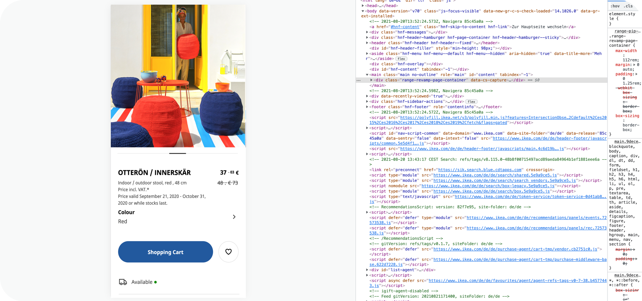
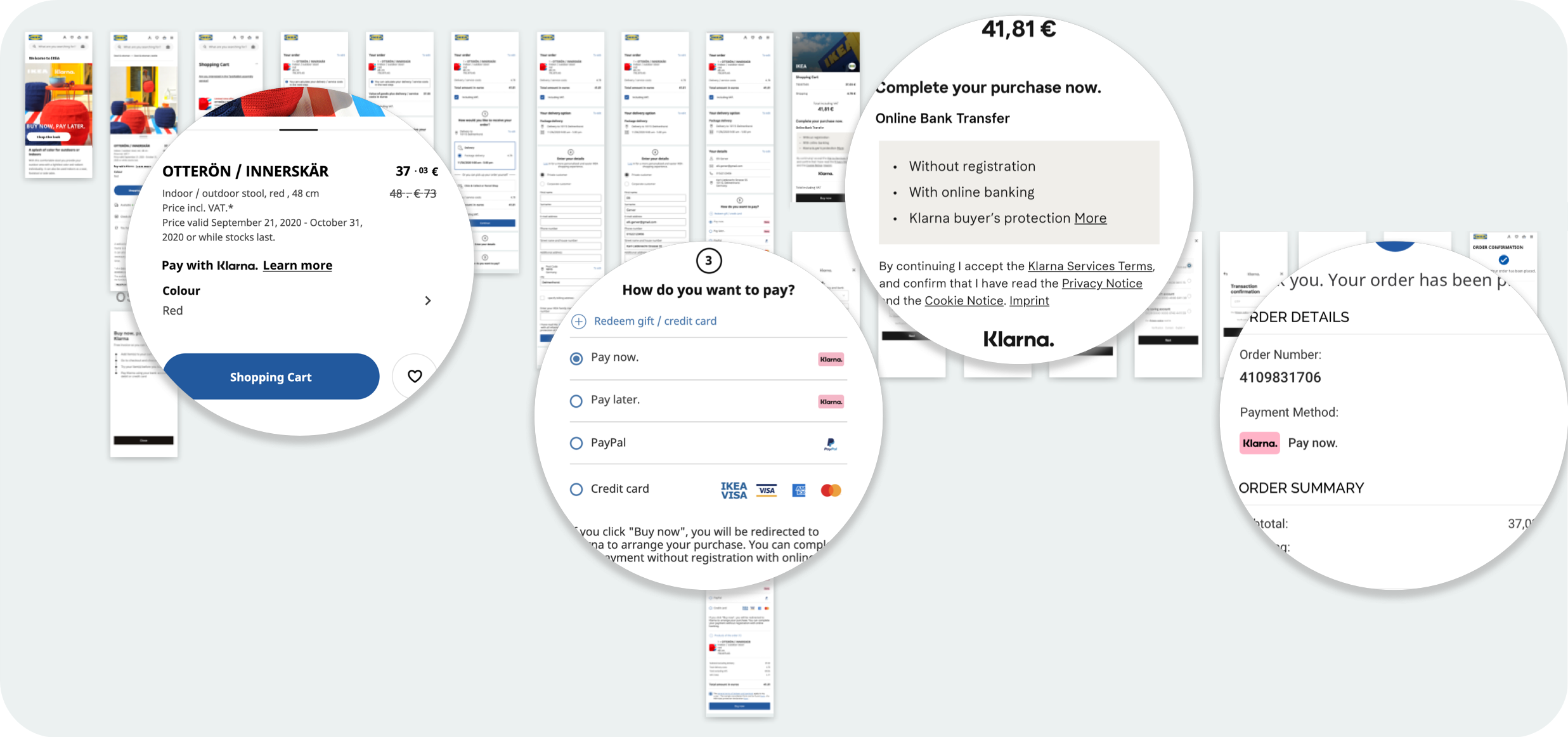

Overview of Klarna’s touch points.
(From left to right)
“Pay with Klarna” is added below the price to alert the user of Klarna’s financing option.
The “Buy now, pay later” banner is added onto the desktop product page.
Klarna’s payment options are seamlessly added to IKEA’s current checkout.
The order confirmation page showcases the user’s Klarna purchase.
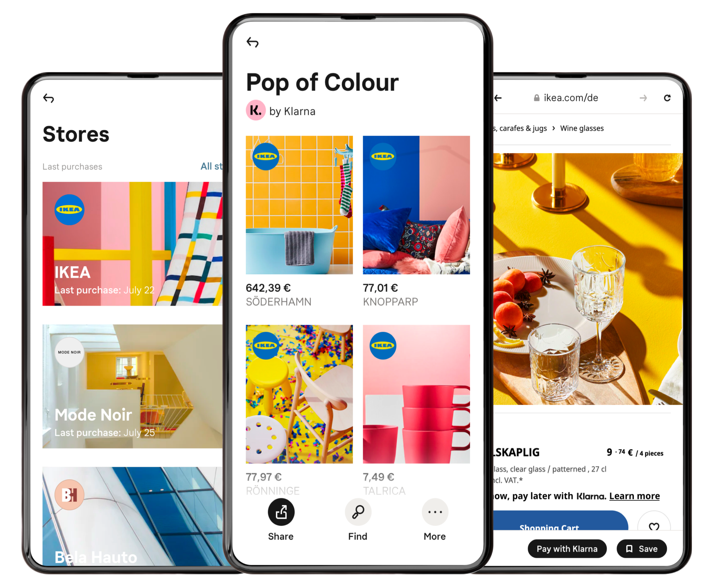
App Overview.
(From left to right)
IKEA receives their own store page in the Klarna app as a Klarna partner. This feature appears after a Klarna user has made an IKEA purchase.
As a Klarna partner, IKEA can work with our marketing team to create curated shopping lists. I have created a conceptual list entitled “Pop of Colour” (an EU spelling for an EU merchant, of course).
A Klarna user can make IKEA purchases via the Klarna in-app browser.
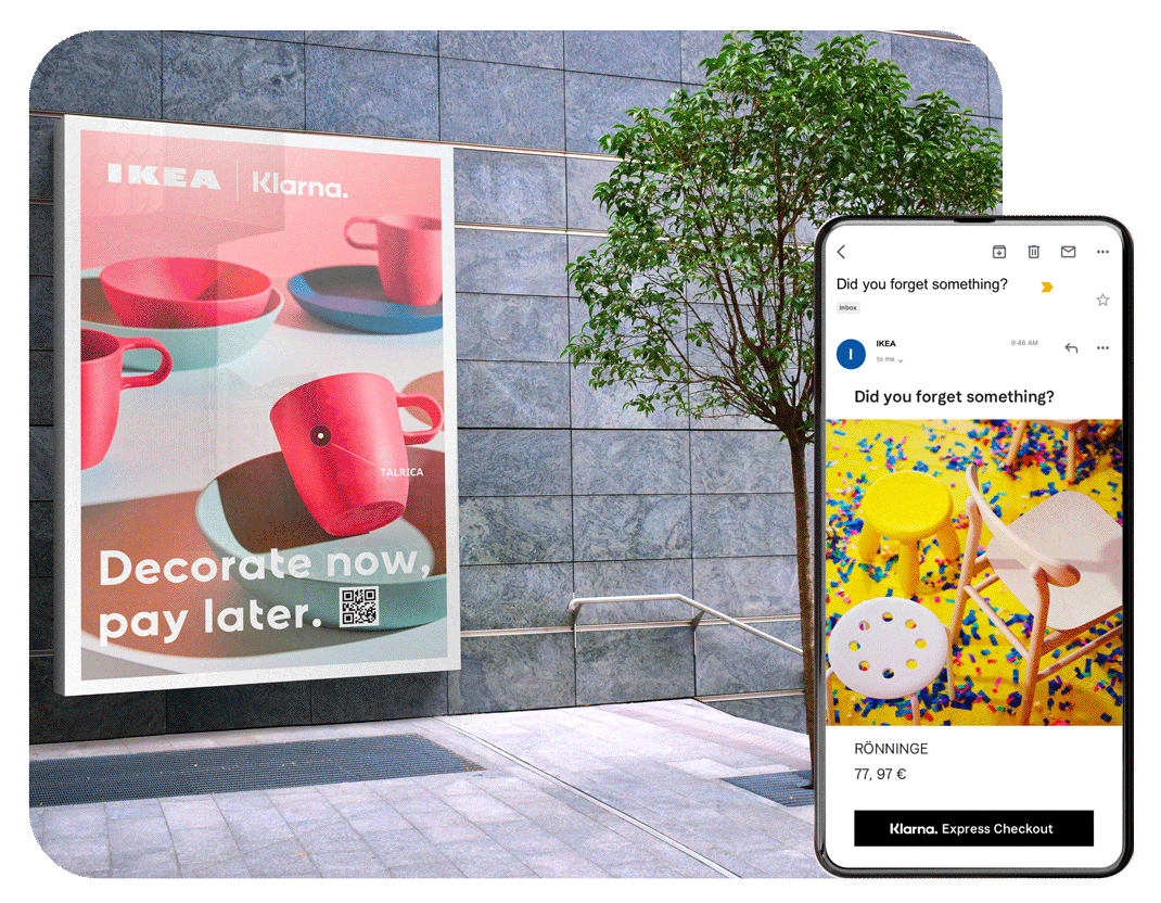
Instant Shopping.
The QR code billboard: When scanned by a phone, a walker-by can complete a purchase in seconds.
Klarna express checkout button: The Klarna express checkout button can be implemented on web touch points, the user can complete a purchase from this point.