Banking App
A flexible, white-label banking app built to deliver clear, confident money management for users, while enabling teams to launch and rebrand quickly across clients.
My Role
Led product and system design for a zero-to-one white-label banking platform.
The Problem
No shared design language, no reusable components, and aggressive delivery timelines across multiple clients.
Impact
Developed a scalable banking app and a tokenized system that enabled rapid rebrands and repeatable client launches.
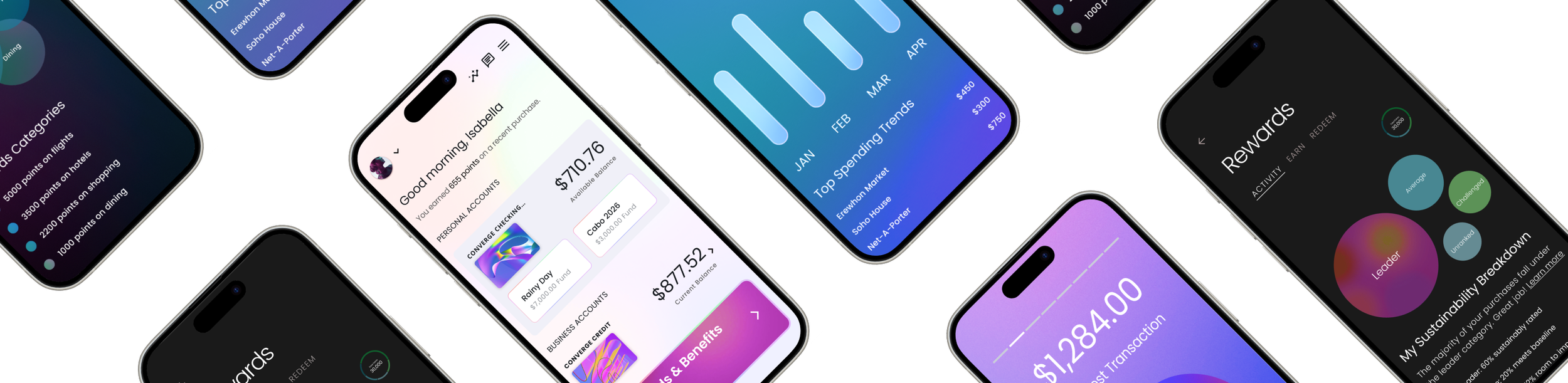
Rewards
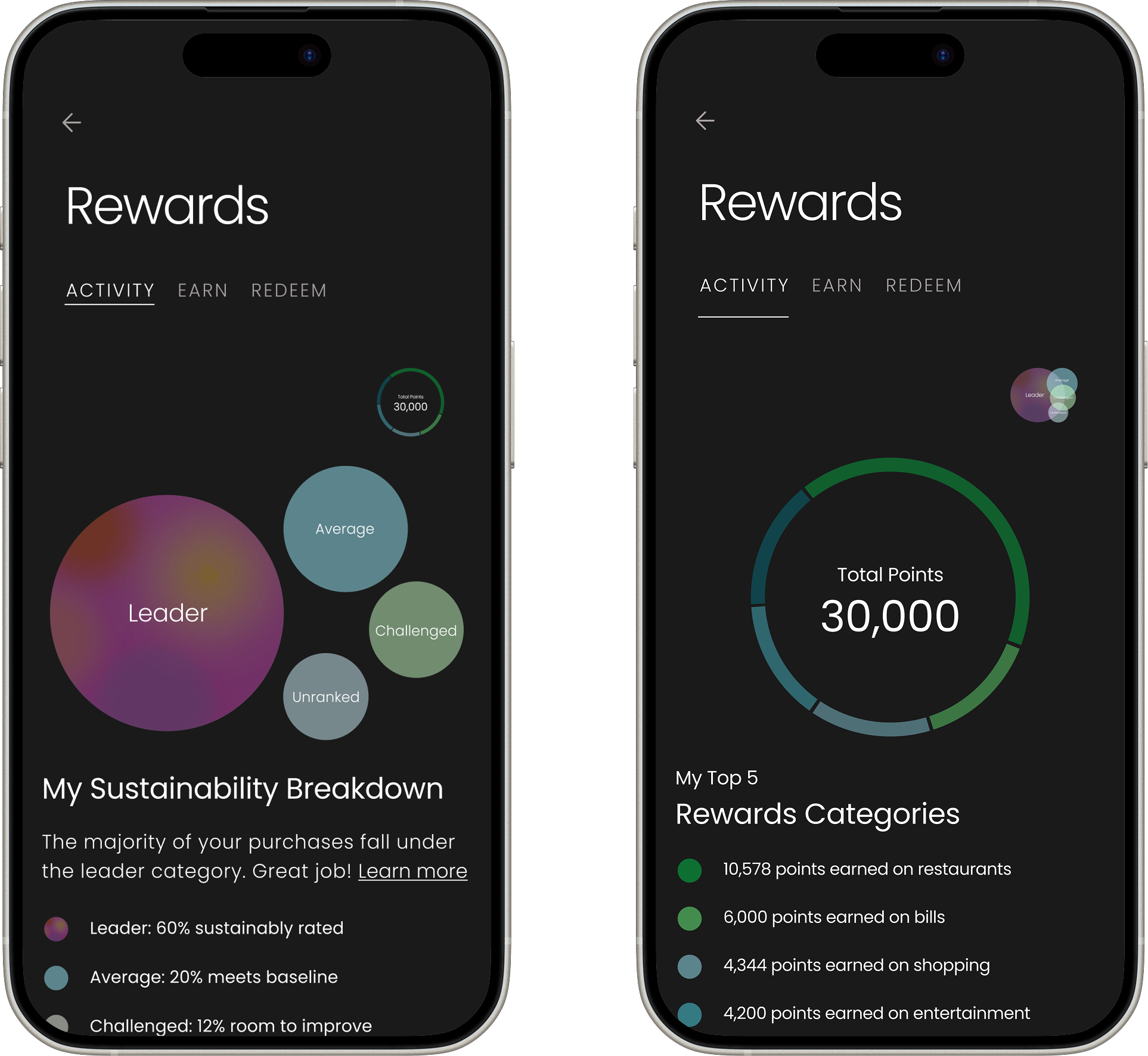
I designed the Rewards experience to help users quickly understand their sustainability impact and rewards breakdown. I initially explored more complex visualizations like a treemap, but when I ran early usability testing myself, it became clear that users struggled to explain what they were seeing or how to interpret the data.
Based on that feedback, I simplified the experience into two scannable views: a bubble summary for fast pattern recognition and a category ring for deeper exploration. This iteration reduced time to comprehension by roughly 40% in testing and eliminated the need for explanation, allowing users to understand their rewards status at a glance while keeping the experience visually engaging.
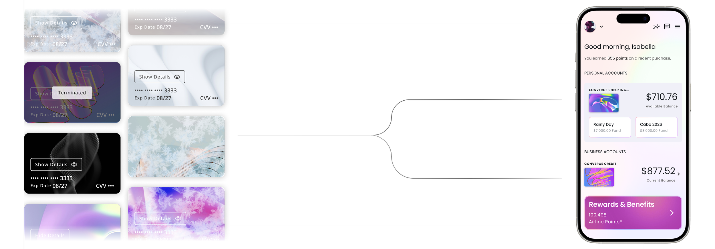
Cards Design
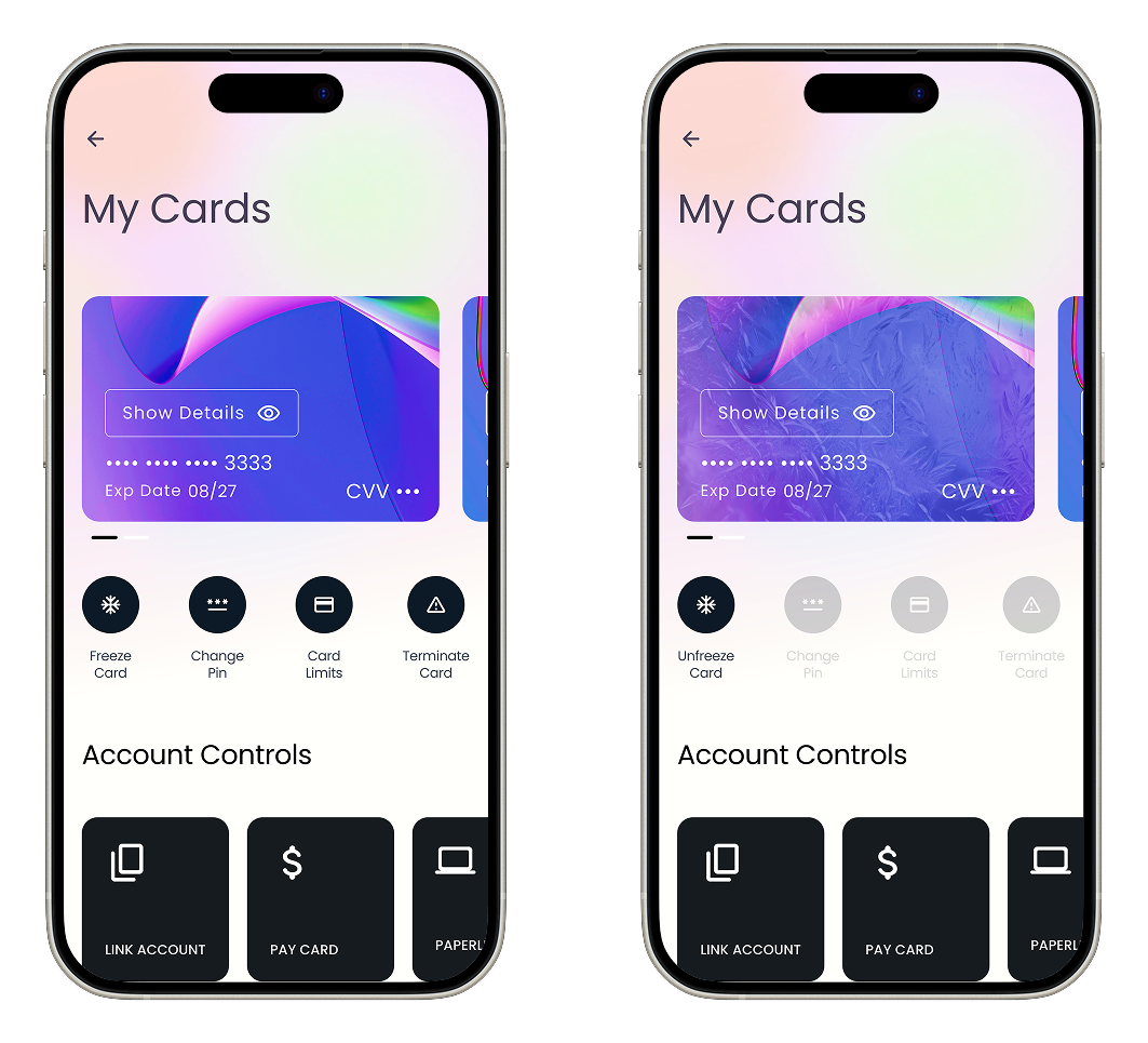
Originally, card actions lived in a stacked list farther down the screen. It was complete, but slow: users had to scroll, hunt, and then double-check they were acting on the right card, especially when managing multiple cards. In early sessions we saw hesitation around high-impact actions like Freeze and Terminate, plus a lot of back-and-forth just to confirm they had the correct card selected.
We iterated by moving the most-used actions closer to the card and adding quick-access controls (Link Account, Pay Card, etc.) as dedicated modules instead of burying them in the stack. The intent was to reduce time-to-action while making risky actions feel deliberate. In testing, users completed common tasks faster, made fewer mis-taps, and reported higher confidence because the controls were grouped with the card context and the primary workflows were immediately available.
One Component, Infinite Variations
Building on Material 3, I created custom banking components including dashboards, cards, onboarding, status modules, alerts, and tiles. Each was designed as a scalable variant connected to the token system, ensuring consistent styling and predictable implementation for engineering.
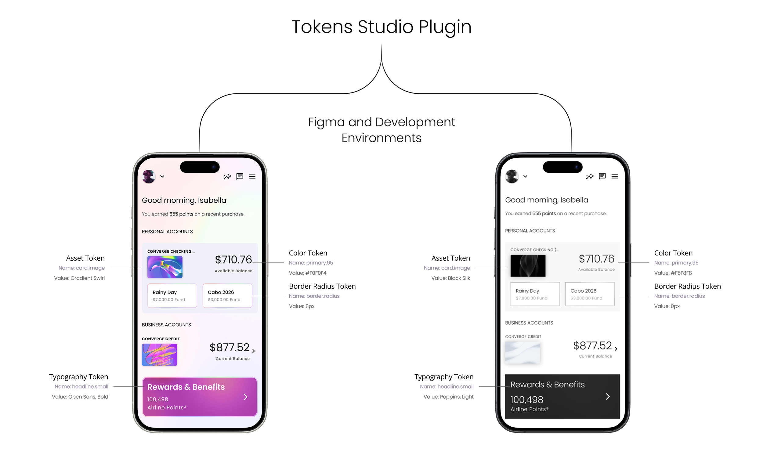
Build Once, Brand Anywhere
Using Material 3 as the foundation, I customized our core design primitives and mapped them into Token Studio with M3 naming conventions. This became a unified source of truth for design and engineering, enabling every screen in the product to be fully tokenized and automatically brand-adaptive.